14/10/2010

Actors + Producers


The following people are involved in the product and will help to create the trailer.


Sean (me)
I play the man which finds his friend dead and is blamed for the murder of him. I will be shown casually dressed in the footage, but a mugshot will be used on the news report showning me in black. I will be the primary footage editor and producer.


Sarah


Sarah plays the killer in the trailer and is the muderer of Rowan. Her costume will be a dark hooded, with ripped jeans, to create a psychopathic look.

Rowan

Rowan plays the man who was murdered. He will have a casual costume and have a football
as a prop.


30/09/2010

1st Draft Film Trailer


The following clip is our first attempt at creating a trailer. Looking at it now it can be quite humorous and entertaining bad to watch. Use of costume and lighting are not used in the footage. The first cut is Sean and Rowan walking towards the camera in a long two-shot, which shows communication. The next shot is a pan shot which shows Rowan walking into the forest area while somebody is watching him. This creates suspense by showing the audience that something is about to happen, by showing Sarah hiding behind the tree. No sound is used while Rowan walks into the forest. The next cut shows Rowan in the forest while Sarah attacks him by stabbing him in the back. Sean then finds Rowan lying on the floor after wondering why he has taken so long. For this clip a handheld is used representing the point of view of the killer (Sarah). A still shot is used showing myself and Sarah run out of the forest down the hill. I believe a more appropriate shot for this would have been an establishing shot. The following cut is a still camera also with me and Sarah running past in a cat and mouse situation. I believe if produced properly this can be a interesting effect. The final part shows Sean hiding around the corner from Sarah, while she runs past not detecting Sean. The camera pans onto Sean hiding while Sarah runs past. I believe this is also quite a interesting idea.

There are some parts in the clip which were attempted twice and were not edited out. This is because we decided to try and create something with no editing. Scenes were Sean finds Rowans body were attempter twice, and the footage of Sean running were Sarah chasing him down a hill. On the clip with the still camera with sarah and sean running past also, you can see sarah in the background waiting for her que to run. Also on the final part you can slightly see Seans arm before the camera pans onto him. In the future we need to make sure we are not making mistakes like this because though it is quite humorous, it looks unprofessional.

27/09/2010

1st Questionnaire (Results)

Out of the 30 questionnairs i gave out to students in my school, i recieved 28 of them back. The results show that the majority of pupils that taken the questionnaire were aged 17-19.
The results shown from this graph show that Adventure films were the most popular, closely followed by Action films. Horror films came after these 2 genres and Musical films were the less favourite. I have decided with this information that the final film that we produce will most likely be an Action-Adventure or a Horror. People written that they are introduced to films by other people through mouth to mouth. This is what about half of the people wrote. Other people also wrote they are from advertising, may this be on television, internet, publish's or public advertising boards. Also, the majority of people (around 80-85%) stated that they do not read film reviews.

More people stated they watch three to five films weekly. This was the highest majority on the chart. People told me many ways in way they would watch a film. People wrote "Entertainment", "emotional reasons" and "shock value". They also wrote how they would watch a film just because they are both and it is something to do.
About 2/3rd of the people who took the questionnaire shown they like experimental ideas in films. Experiments can be created in the footage we create, but this could effect the genre of the film and the meaning of it, so this should be considered when producing it.


I asked people which genre of film comes to mind when a colour is presented to then. People wrote:


Red: Horror, Romance


Blue: Comedy, Adventure


Yellow: Feel Good, Childrens


Purple: Sci-fi, Mystery


Black: War, Crime


With this information I can use the listed colours in the posters, magazine covers and trailers I create in the future. Some catorgorys were written more then once in each colour, like Horror was also written in Black.


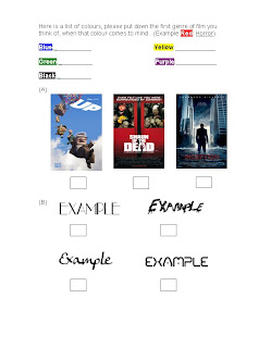
I listed a few film posters and asked which poster the auidence would the most eye-appling. The majourity of the people who taken the questionnaire chose "Up". I believe this is due to the bright colours used in the poster and family friendly feel. People chose "Inception" secondly and then "Shaun of the Dead". I believe this is because of the abstract surreal look of "Inception".

Out of the 4 font examples, people stated that this is their favourite text out of the four on show, I believe this is because of the futuristic, yet dark style. The result of the text in my opinion was accually quite surprising for i thought that this would be the least favourite.

16/09/2010

1st Questionnaire

The following questionnaire will help me discover what the audience like in a film and how they are introduced to a film. I am going to print off 30 copies of the questionnaire and hand it out to fellow pupils, to fill in. I will look at the questionnaires individually so I can discover what kind of films people enjoy, and what sort of text and colours they also like. This is so i can relate which colours go with which genre of film. One of the questions I asked is which out of three film posters they believe stands out most. I took the film poster for "Up", "Shaun of the Dead" and "Inception", which are all different genres of films and have different types of colours, images and texts used in their posters. This will help me discover what sorts of these features I shall use when creating a poster. I also asked what the first genre of film was when I presented a colour to them, with an example red being related to horror. I finally asked what their favourite sort of text is.


09/09/2010

I am Legend - Film Poster

The promotional poster for "I am Legend" is on location in a ruined New York which is where the film is set. It has the character in the middle of the poster with his dog on the left, showing the connection of the two characters and has a heroic stance. The character in the poster (Will Smith) is shown in casual looking clothes. The location and lighting of the image looks very dark which gives the film a more frightening feel. The poster looks more mature and would not attract children because of it. The ruins shown in the background shows the audience the film is set in an post-apocalypse time. Text on the poster is smaller compared to other posters, but this is probably so the picture gets the audiences attention. The dog in the picture can be seen as a character, but also a prop.

I am Legend - Trailer


The trailer for "I Am Legend" use's a lot of different experimental camera angles through-out the film. Crane shots are used frequently to show surroundings and happenings in the film. There are also a lot of two-shots at the beginning of the trailer showing the connection between the main character and his wife. Effects are used like straight cuts to show real-time fast paced action, while afterwards when the trailer footage is more calm, allot of fade effects are used. Slow-motion effects are used a lot to also show the connection in the main character and his family. A lot of costume is used which includes Military and the public. The Military costume shows the public they have power. The location set is New York, a very busy hectic place. In the film though it is shown as a empty, abandoned place. The only sound really used (apart from some use of sound effects) are non-digetic music which sounds very powerful and gloomy. This represents the silence of the once busy town which is New York.

I am Legend - Magazine Cover


The "I am Legend" cover for Empire magazine is a basic design for a front cover for a film, showing the films star "Will Smith" in a blank photo which represents him as the main film role. Costume is used where he is wearing normally casual clothing and a gun is used as a prop. He is stood in a heroic stance to show he is the hero of the film. Because of this people can tell that it is an action. Big bold text is used with different fonts, colours and sizes. The magazine has a basic design layout which features Headings. Poof’s and Pictures.

12/07/2010

School of Rock - No Magazine Cover

School of rock is a family-friendly film which over previous years, has grown in popularity and is becoming a classic film which a lot of people have seen. School of Rock was not given a lot of publicity and advertisements as other films do, as it was realised around the time that other major films were realised, like The Grudge and Shark Tale. School of Rock was pushed to the side so these films can be promoted more efficiently, this meaning that there are no magazines with School of Rock on the cover. Over the years the film became more successful then film promoters would have thought, even with not as much publicity as other films. This has made me realise that advertisement does not need to be necessary to publish a successful film.

School of Rock - Film Poster

The film poster for "School of Rock" can be seen as a spoof of Rolling Stone Magazine, which is a mainstream music magazine and one of the biggest selling in the world. The poster has the iconic red text which is in the same font as Rolling Stone magazine's Heading. The poster includes just one image of Jack Black (The Teacher) with hes pulils in the background dressed as rockstars from different types of genres. Because of the image having both adult and children on it, people can see that it is a family film. People can also see it is a comedy film because Jack Black is on the front who is which a comedy marvel to some, in recent years. It is an traditional film poster with the film's hero standing in the front. The poster shows to the auidance that the film is an film about music, with props like guitars and drumsticks. Costume is also used on the puilps which makes them look like punk rockers.

School of Rock - Trailer


The trailer for school of rock gives away the plot of the movie to the audience. By watching the trailer you can tell the film is a feel good comedy for the family. There are a lot of close ups of people's faces on the trailer to show expressions in their faces, there are also a lot of two-shots and shots using the rule of thirds to show characters together in one clip. An example of this is where 3 students are stood in front of a wall together. A lot of musical instruments are used as props as music is the main focus in the film. The teachers in the film are also dressed in costume very formally and smart which shows. The main location is a school classroom where the teacher teaches has students to play in a band. The non-digetic sound used in the clip are upbeat rock music tracks, which represent the movie also. Songs by iconic rock bands like Alice Cooper and Cream are used.

24/06/2010

The Matrix - Trailer


The matrix trailer introduces the film to the auidance and shows the plot, genre and type of film it is. Camera angles used are very close to the charaters faces and close up's are used quite alot in the trailer. This shows expressions in the faces of the actors. Other effective camera shots are also used though which fit into the action/sci-fi genre which The Matrix is. Pan shots are used to show location and people on set. Establishing shots are also used showing location in wider areas. The rule of three is also used on a shot of three men in suits aiming their guns. These are all effective to the action type of film it is. Black clothing is used alot in the trailer to show the charaters are secretive and not normal or traditional. The sound used is very sudden, and will catch the viewers attention. Non-Digetic upbeat music is used which represents an action film, which would normally use faster tempo music.

The Matrix - Magazine Cover

This is the cover of Empire which was released in 1999. The cover has a picture of the films Hero which is played by Keanu Reeves, which takes up most of the page to catch the auidances attention and give The Matrix more publicaity and advertise it. The cover is different compared to the film itself, the poster and trailer. Colours used are bright and different compared to the dark mood the film creates. The film name stands out compared to other text used on the cover to catch the auidances attention. Being on the cover of Empire relates to the older target market of the film because Empire is a more mature magazine and older people intrested in movies will purchase it, so The Matrix being on the cover will promote the film to them. The cover is also different compared to the trailer and poster, use of lighting on the image is very bright which is a the oppersite of how the presintation of the trailer and poster. Also less detailed props and costume is used like weapons or sunglasses making the image look less of an cover to promote an action film. This magazine cover does not really link to the trailer or posters used for The Matrix, I believe this is because of the lighting being very different to how the film is.

The Matrix - Film Poster

In the promotional film poster for "The Matrix", four people are stood standing in a heroic stance which shows the auidance it is an action/sci-fi film. It is a traditional film poster with the film hero's presented stood in front of the other sub-charaters. The text is smaller compared to other Posters which makes the image stand out and look bigger. The colour black is used and makes the poster look and feel dark and gloomy which represents the film. It appeals to it's target market which are older people (BBFC age being 15+) so people below its age will not watch the film. You can tell it is an action film by looking at the poster. The props, costume and lighting shows that this is a film with fight scenes and unatural scenes which also relate to the older target market. The poster trailers and magazine covers also join together to create an primary design for the film. This poster has it's basic features and presintations which other movie posters also have.